Year: 2015
Role: Creative Technologist, Concept Design
For: Red Bull Radical
During Red Bull Radical, a seven-month design competition, I collaborated with a multidisciplinary team to develop an innovative packaging concept that transforms traditional beverage containers into interactive gaming experiences.
The project emerged from a key insight: while Red Bull's brand identity centers on extreme sports and adrenaline-fueled experiences, the beverage is predominantly consumed in office environments where opportunities for physical excitement are limited. Our solution bridged this experiential gap by embedding classic games directly into the packaging design, bringing Red Bull's adventurous spirit to workplace settings while promoting social interaction and extending the package lifecycle through creative reuse.
The concept developed organically during the competition kickoff when our team spontaneously created a ring toss game from available packaging materials. This impromptu play session attracted participants from other teams, providing immediate user validation and demonstrating the natural social catalyst potential of interactive packaging. Building on this insight, I focused on translating traditional game mechanics into packaging constraints while maintaining Red Bull's brand aesthetic and functional requirements. The design process required careful consideration of structural engineering to maintain package integrity during game piece removal, material selection for optimal folding and durability, and production feasibility for specialized cuts and perforated elements.
I developed three distinct packaging concepts, each integrating different game mechanics.
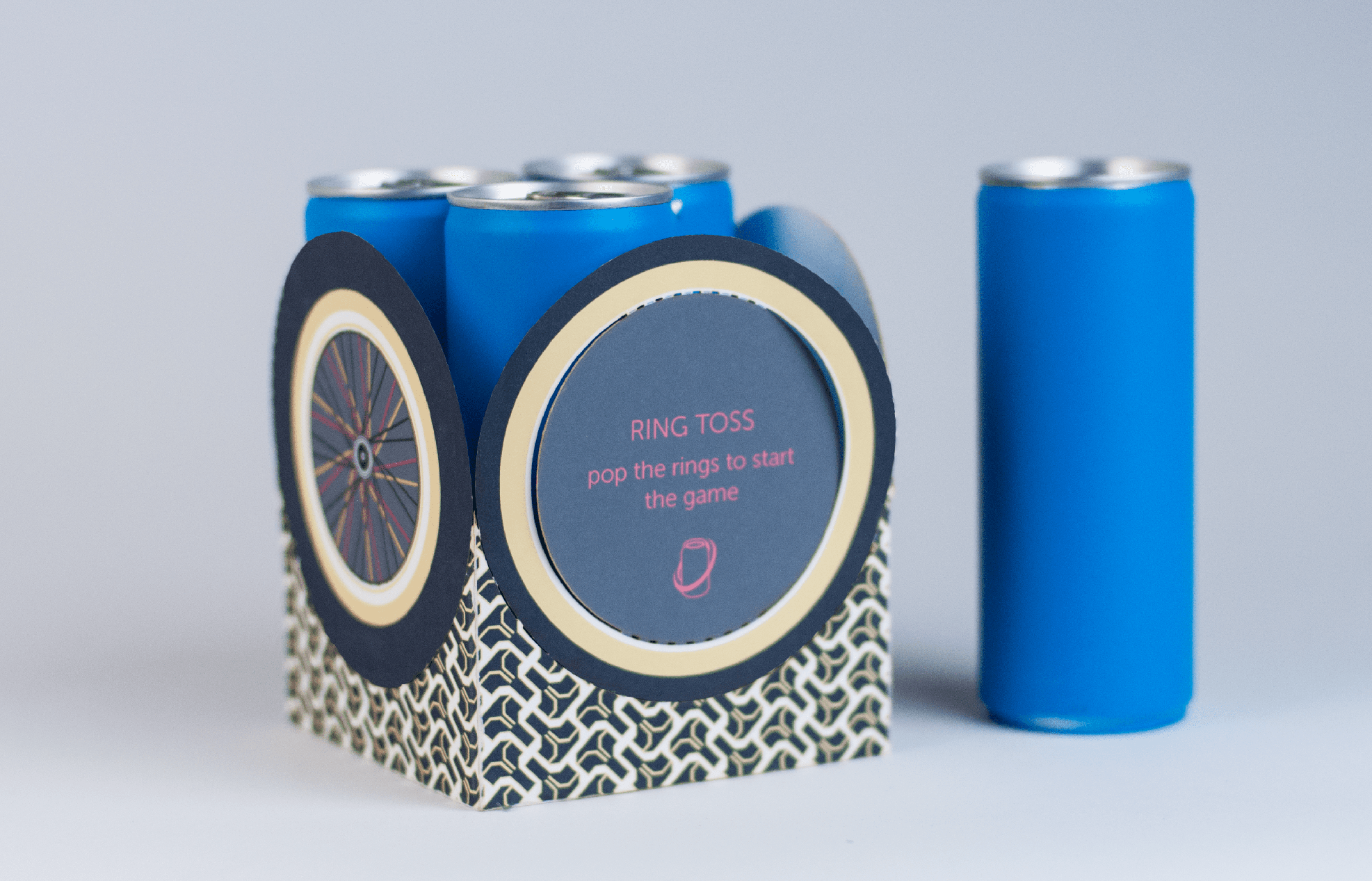
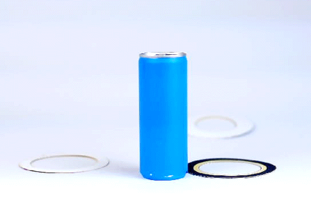
The Ring Toss package featured perforated rings that served dual functions as carrying handles and game pieces, allowing players to throw rings toward a can-pole while maintaining package integrity when pieces were removed. The tire tread-inspired graphics reflected Red Bull's extreme sports heritage, with variable ring widths creating scalable difficulty levels.
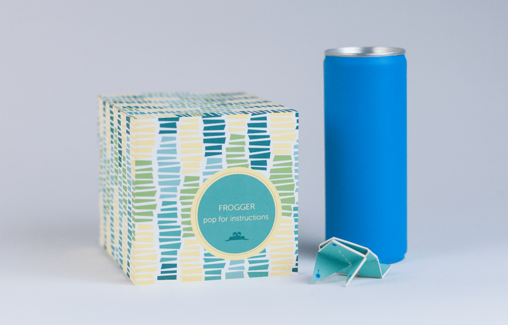
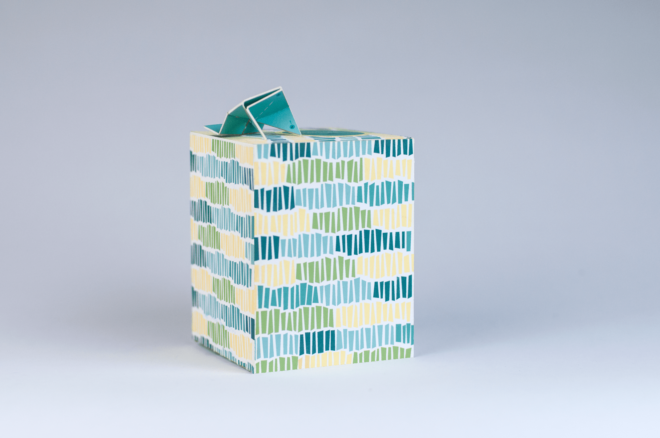
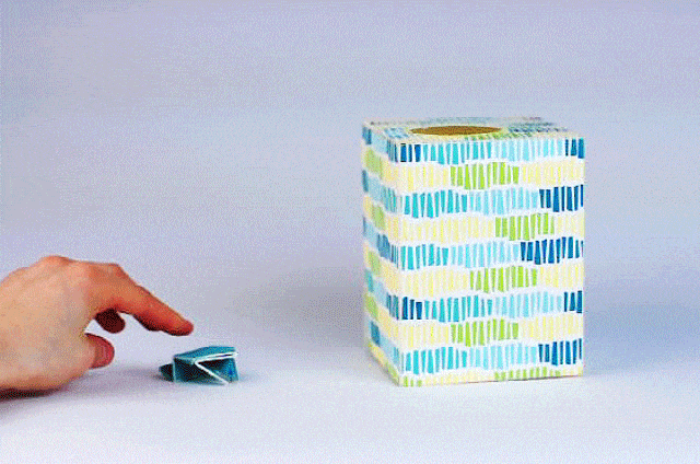
The Frogger package transformed flat packaging material into a functional 3D game piece using traditional Chinese origami techniques, where a perforated circle created both a carrying handle and target for the jumping frog. Grass-pattern graphics connected to natural environment themes while incorporating "33/21" basketball scoring mechanics for extended play.
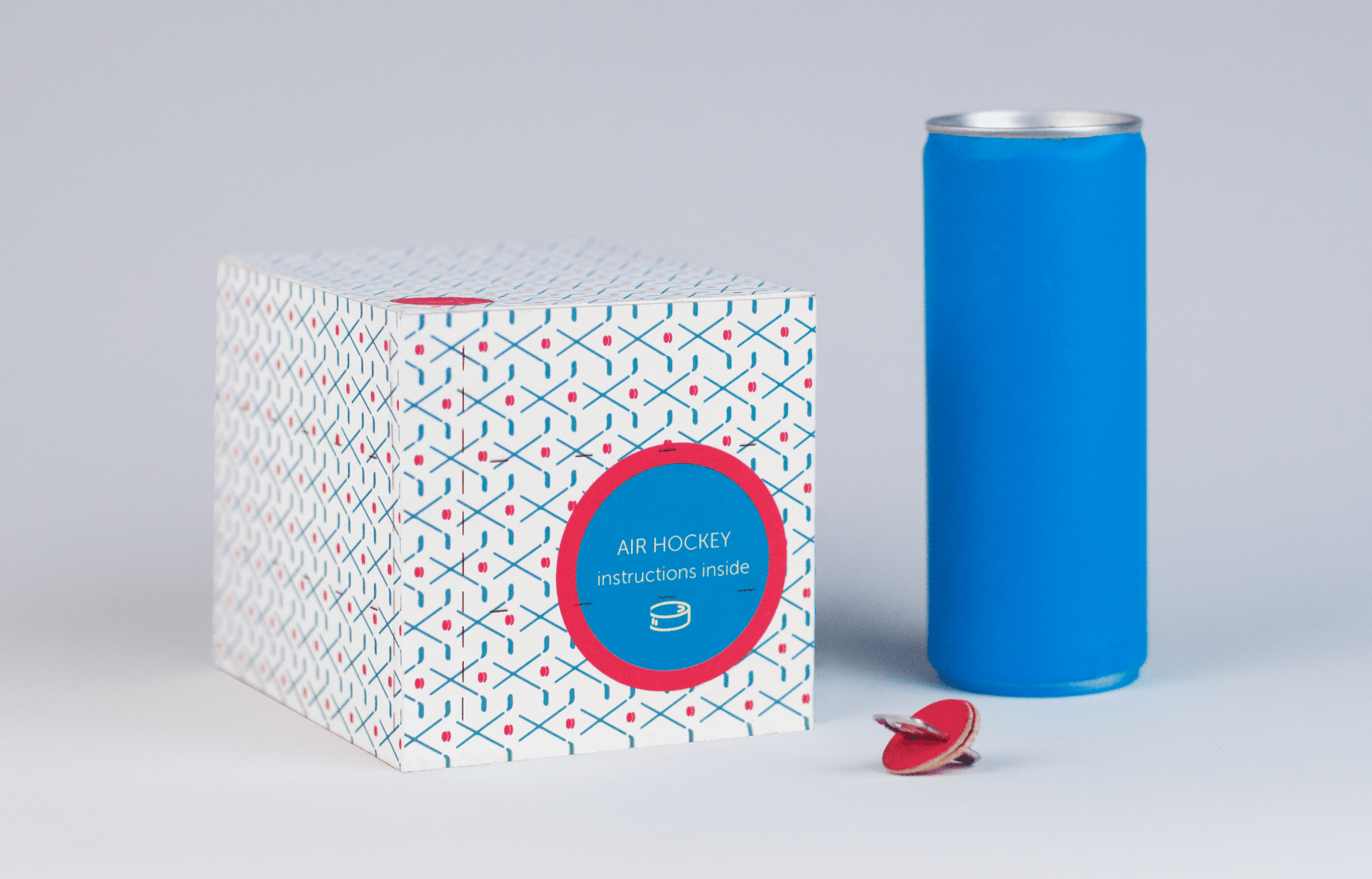
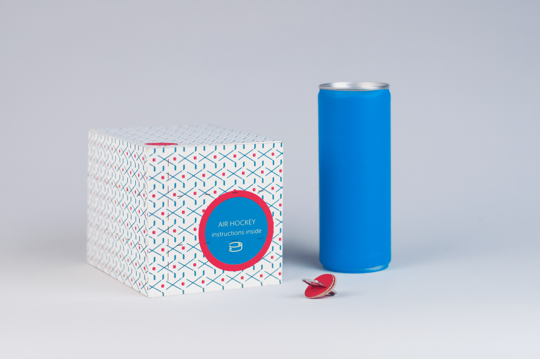
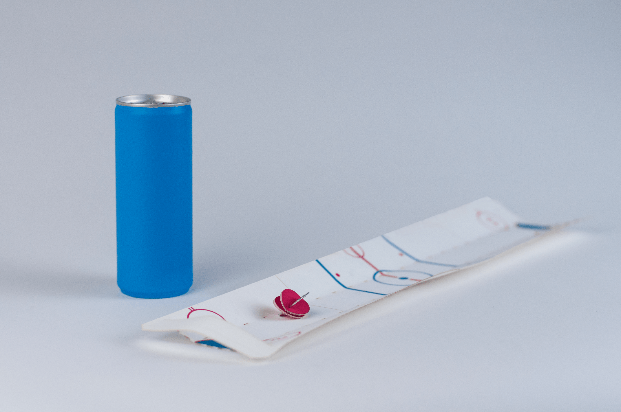
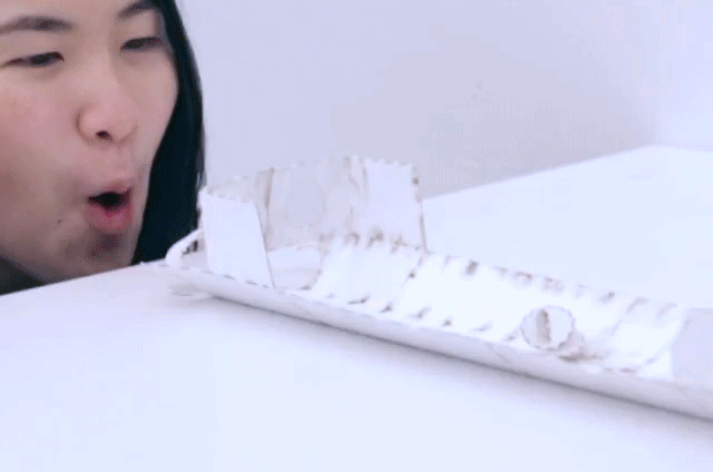
The Air Hockey package converted the entire container into a game arena, using breath-powered gameplay with a puck created from can-tabs and perforated circles, while cut-out gates maintained structural integrity and hockey stick motifs reinforced sports connections.
Each package design maintained Red Bull's distinctive brand identity while incorporating game-specific visual languages that bridged the brand's extreme sports positioning with accessible gameplay. The Ring Toss featured extreme motocross aesthetics, Frogger balanced digital game nostalgia with natural grass textures, and Air Hockey emphasized clean sports graphics with crossed hockey stick patterns. This approach made the brand more approachable while maintaining its adventurous edge and demonstrated how traditional packaging could evolve into experiential design, creating extended brand engagement beyond point of purchase, social interaction opportunities in corporate environments, sustainable practices through package reuse, and meaningful brand differentiation in the competitive beverage market.